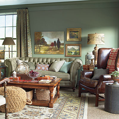
While we continue enjoying Jennifer's wonderful kitchen renovation and all the fabulous "Before and Afters" linked for yesterday's Met Monday, lets take a little tour of some more of the rooms in Abercorn Place, this year's Southern Living Idea House in Senoia, Georgia. I've been sharing the rooms in this 4 story home over the last few weeks and today we're touring three rooms: the Living Room, the Entertainment Room and the adorable Craft Room the designer created out of a very small bedroom.

Living Room:
Let's start in the living room...it has a bit of "library" feel with all the wonderful built-in shelving.

Here's a photo from the Southern Living Idea House site. All the smaller photos you'll see today are from their online site.

The designer chose to decorate this room in soft blues and greens which he felt reflected the landscape of Senoia since it's a rural area. The mantel over the fire place looks so small doesn't it? Wait until you see it decorated for Christmas!

Here's the same mantel decorated at Christmastime. Looks huge here, doesn't it?

Here's how the mantel looked the day I toured the home...not so fresh anymore. It's interesting to compare it to when it was first decorated a few weeks before. In case you are wondering, this mantel in this room is not the same mantel I shared in THIS post. The mantel I shared previously was in the Keeping Room off of the kitchen.

Entertainment Room:
This is the upstairs "Entertainment Room." This room was designed as a getaway/entertaining spot for the adults in the home. The children have their own place for entertaining friends in the family room down on the terrace level. This space has some really neat features that really wouldn't be too difficult to incorporate into your average home.

I took this pic and I'm not sure why I focused it so low. Perhaps I was trying to get a photo showing how the designer layered the rugs. Note the furniture piece in the corner of the room. It is designed specifically for the storage of wine.

Here's another view of this room from Southern Living online. You may recall from my previous posts, I wasn't able to get many full room pics due to the large number of folks touring the house this day. Thankfully, I was able to find some pics online to share showing larger views.

This room has a small bar area. The designer placed lawyer or barrister bookshelves on the wall for the storage of the wine glasses. I'm not sure if I like this idea because those cabinets open up by the glass front sliding inside the cabinet across the top of whatever is inside. You would have to make sure your wine glasses were not even a smidgen too tall for this to work. They do look great, though!

Under the counter hidden behind closed panels you'll find a wine cooler, an ice maker and a small refrigerator. Perfect for a room designed for entertaining.

This is kind of a neat idea. The designer framed the t.v. on the wall behind the bar to make it feel more like art when it wasn't in use.

A view of the other side of this room. I'm not too crazy about the color green chosen for the walls...but otherwise, I do like this room. Actually, looking back at the photo I took, I loved the color of the walls in my photo. This photo below is from the SL site and the green looks very different, doesn't it?

Craft Room:
Now for the Craft Room...this is a pretty cool idea. The designer felt this small bedroom was really too small to be used as a bedroom, so he turned it into a Craft Room.

The stool is designed to look like a giant spool of thread. :)

Check out the closet off of the Craft Room...lots of custom made cabinetry designed with crafting in mind.

So what do you think about the spaces you toured today? Did you like the Entertainment Room? How about the Craft Closet? I can't wait to show you all the outdoor "rooms" in an upcoming post. I think you're going to love all those wonderful spaces...I know I did! :)


Living Room:
Let's start in the living room...it has a bit of "library" feel with all the wonderful built-in shelving.

Here's a photo from the Southern Living Idea House site. All the smaller photos you'll see today are from their online site.

The designer chose to decorate this room in soft blues and greens which he felt reflected the landscape of Senoia since it's a rural area. The mantel over the fire place looks so small doesn't it? Wait until you see it decorated for Christmas!

Here's the same mantel decorated at Christmastime. Looks huge here, doesn't it?

Here's how the mantel looked the day I toured the home...not so fresh anymore. It's interesting to compare it to when it was first decorated a few weeks before. In case you are wondering, this mantel in this room is not the same mantel I shared in THIS post. The mantel I shared previously was in the Keeping Room off of the kitchen.

Entertainment Room:
This is the upstairs "Entertainment Room." This room was designed as a getaway/entertaining spot for the adults in the home. The children have their own place for entertaining friends in the family room down on the terrace level. This space has some really neat features that really wouldn't be too difficult to incorporate into your average home.

I took this pic and I'm not sure why I focused it so low. Perhaps I was trying to get a photo showing how the designer layered the rugs. Note the furniture piece in the corner of the room. It is designed specifically for the storage of wine.

Here's another view of this room from Southern Living online. You may recall from my previous posts, I wasn't able to get many full room pics due to the large number of folks touring the house this day. Thankfully, I was able to find some pics online to share showing larger views.

This room has a small bar area. The designer placed lawyer or barrister bookshelves on the wall for the storage of the wine glasses. I'm not sure if I like this idea because those cabinets open up by the glass front sliding inside the cabinet across the top of whatever is inside. You would have to make sure your wine glasses were not even a smidgen too tall for this to work. They do look great, though!

Under the counter hidden behind closed panels you'll find a wine cooler, an ice maker and a small refrigerator. Perfect for a room designed for entertaining.

This is kind of a neat idea. The designer framed the t.v. on the wall behind the bar to make it feel more like art when it wasn't in use.

A view of the other side of this room. I'm not too crazy about the color green chosen for the walls...but otherwise, I do like this room. Actually, looking back at the photo I took, I loved the color of the walls in my photo. This photo below is from the SL site and the green looks very different, doesn't it?

Craft Room:
Now for the Craft Room...this is a pretty cool idea. The designer felt this small bedroom was really too small to be used as a bedroom, so he turned it into a Craft Room.

The stool is designed to look like a giant spool of thread. :)

Check out the closet off of the Craft Room...lots of custom made cabinetry designed with crafting in mind.

So what do you think about the spaces you toured today? Did you like the Entertainment Room? How about the Craft Closet? I can't wait to show you all the outdoor "rooms" in an upcoming post. I think you're going to love all those wonderful spaces...I know I did! :)
